A few weeks ago, we shared some key startup metrics (16 of them, to be exact) that help investors gauge the health of a business when investing in it.
But to repeat ourselves for a moment: Good metrics aren’t just about raising money from VCs … they’re about running the business in a way where founders can know how — and why — certain things are working (or not), and then address them accordingly. In other words, these metrics aren’t just for pitching but for discussing in subsequent board meetings, quarterly updates, and management meetings. As one reader shared: “Drive with them, don’t just ‘report’ them”.
So (and with thanks to all the folks on Twitter who shared their feedback or built on our previous post), here are 16 more metrics that we think are important to add to the list. And yes, it is a good thing that there are only 16 letters between the A to Z of our name…!
Business and Financial Metrics
#1 Total Addressable Market (TAM)
TAM is a way to quantify the market size/ opportunity. But using the size of an existing market might actually understate the opportunity of new business models: For example, SaaS relative to on-premise enterprise software may have much lower average revenue per user but more than make up for it by expanding the number of users, thus growing the market. Or, something that provides an order of magnitude better functionality than existing options (like eBay relative to traditional collectible/antique dealers) can also grow the market.
While there are a few ways to size a market, we like seeing a bottoms-up analysis, which takes into account your target customer profile, their willingness to pay for your product or service, and how you will market and sell your product. By contrast, a top-down analysis calculates TAM based on market share and a total market size. (There’s a primer with more detail about these approaches here.)
Why do we advocate for the bottom-up approach? Let’s say you’re selling toothbrushes to China. The top-down calculation would go something like this: If I can sell a $1 toothbrush every year to 40% of the people in China, my TAM is 1.36B people x $1/toothbrush x 40% = $540M/year. This analysis not only tends to overstate market size (why 40%?), it completely ignores the difficult (and expensive!) reality of getting your toothbrush into the hands of 540M toothbrush buyers: How would they learn about your product? Where do people buy toothbrushes? What are the alternatives? Meanwhile, the bottoms-up analysis would figure out TAM based on how many toothbrushes you’d sell each day/week/month/year through drugstores, grocery stores, corner mom-and-pop stores, and online stores.
This type of analysis forces you to think about the shape and skillsets of your sales and marketing teams — required to execute on addressing market opportunity — in a far more concrete way.
It is important not to “game” the TAM number when pitching investors. Yes, VCs seek to invest in big ideas. But many of the best internet companies sought to address what appeared to be modest TAMs in the beginning. Take eBay (collectibles and antiques) and Airbnb (rooms in other people’s places); in both these cases, the companies and their communities of users took the original functionality and dramatically expanded use cases, scaling well beyond original market size estimates.
[See also our partner Benedict Evans on ways to think about market size, especially as applied to mobile.]
#2 ARR ≠ Annual Run Rate
While we’ve already made this point in part one of this post, we want to emphasize again that when software businesses use ARR, they mean annual recurring revenue, NOT annual run rate. It’s a mistake to multiply the recognized bookings — and in some cases revenue — in a given month by 12 (thus “annualizing it”) and call that number ARR.
In a SaaS business, ARR is the measure of recurring revenue on an annual basis. It should exclude one-time fees, professional service fees, and any variable usage fees. This is important because in a given month you may recognize more revenue as a result of invoicing one-time services or support, and multiplying that number by 12 could significantly overstate your true ARR potential.
In marketplace businesses — which are more transaction-based and typically do not have contracts — we look at current revenue run rates, by annualizing the GMV or revenue metric for the most recent month or quarter.
One mistake we frequently see is marketplace GMV being referred to as “revenue”, which can overstate the size of the business meaningfully. GMV typically reflects what consumers are spending on the site, whereas revenue is the portion of GMV that the marketplace takes (“the take”) for providing their service.
#3 Average Revenue Per User (ARPU)
ARPU is defined as total revenue divided by the number of users for a specific time period, typically over a month, quarter, or year. This is a meaningful metric as it demonstrates the value of users on your platform, regardless of whether those users buy subscriptions (such as telecom monthly subscriptions) or click on ads as they consume content.
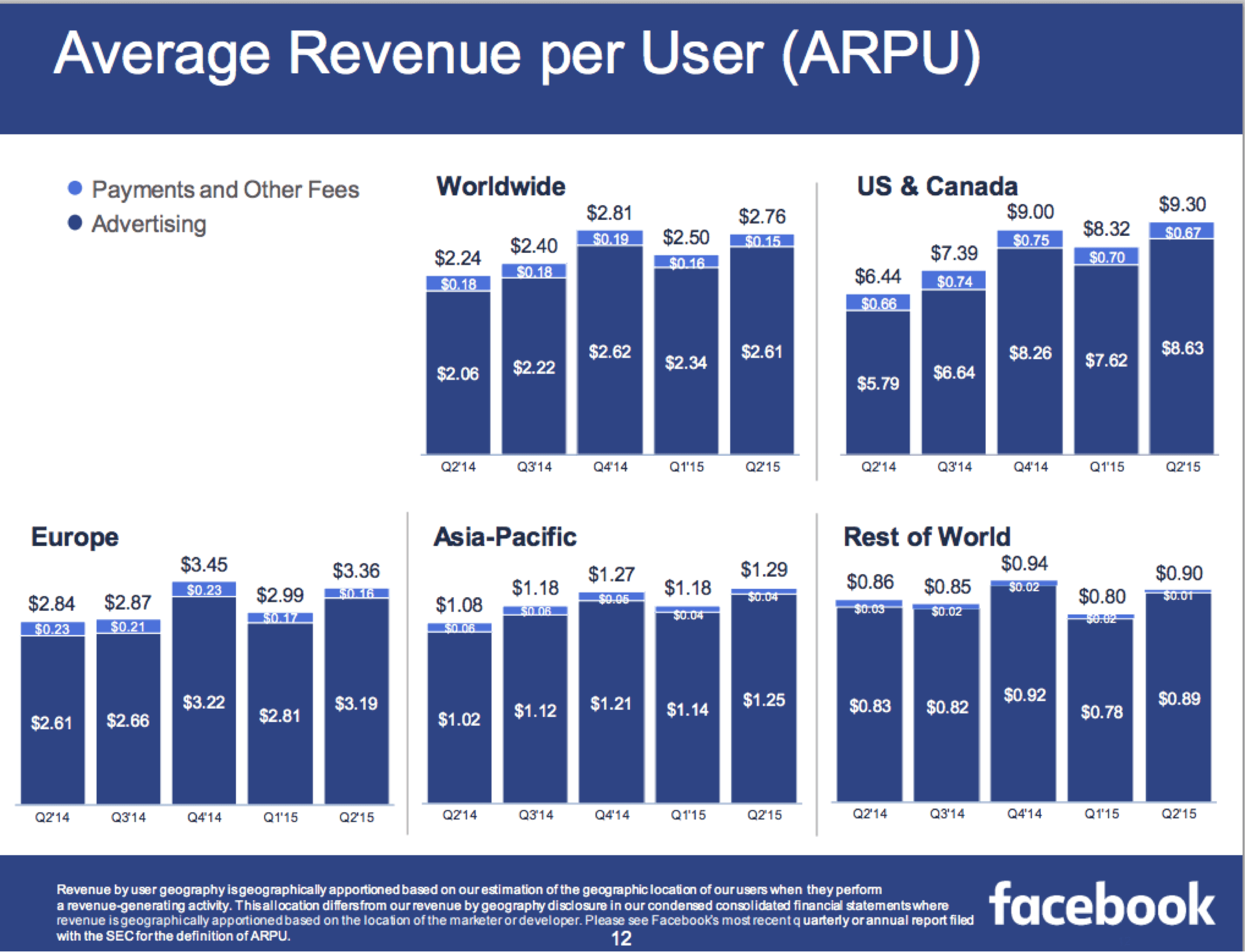
For pre-revenue companies, investors will often compare the prospects of a company against the known ARPU for established companies. For example, we know that Facebook generated $9.30 ARPU in FY2015Q2 from its U.S. and Canada users:
So if we’re evaluating a company with an advertising business that has monetization potential comparable to Facebook, we ask: Do we believe the company can generate a quarter, half, just as much, or even more ARPU compared to Facebook? What would need to be true to justify this belief? How would the company achieve that (and do they have the ability do so)?
#4 Gross Margins
Continuing the conversation about gross margins from our first post, we wanted to say a little more here. Gross margin — which is a company’s total sales revenue minus cost of goods sold — can be considered an equalizer across businesses with different business models, where comparing relative revenue would otherwise be somewhat meaningless. Gross margin tells the investor how much money the company has to cover its operating expenses and (hopefully!) drop to the bottom line as profitability.
A few examples to illustrate the point: E-commerce businesses typically have relatively low gross margins, as best exemplified by Amazon and its 27% figure. By contrast, most marketplaces (note here the distinction between e-commerce) and software companies should be high gross-margin businesses.
Paraphrasing Jim Barksdale (the celebrated COO of Fedex, CEO of McCaw Cellular, and CEO of Netscape), “Here’s the magical thing about software: software is something I have, I can sell it to you, and after that, I still have it.” Because of this magical property, software companies should have very high gross margins, in the 80%-90% range. Smaller software companies might start with lower gross margins as they provision more capacity than they need, but these days with pay-as-you-go public cloud services, the need for small companies to buy and operate expensive gear has vanished, so even early stage companies can start out of the gate with relatively high gross margins.
#5 Sell-Through Rate & Inventory Turns
Sell-through rate is typically calculated in one way — number of units sold in a period divided by the number of items at the beginning of the period — but has different uses and implications in different types of businesses.
In marketplace businesses, sell-through rate can also go by “close rate”, “conversion rate”, and “success rate”. Regardless of what it’s called, sell-through rate is one of the single most important metrics in a marketplace business. As investors, we like to see a relatively high rate so that suppliers are seeing good returns on the effort they put into posting listings on the marketplace. We also like to see this ratio improving over time, particularly in the early stages of marketplace development (as it often indicates developing network effects).
In businesses that buy any kind of inventory — retailers, wholesalers, manufacturers — the sell-through rate is a key operating metric for managing inventory on a weekly or daily basis. It can reveal how well you matched supply of your product to demand for it, on a product-by-product basis.
For many investors, however, inventory turns is a more useful metric than sell-through rate in inventory-based businesses, because it:
— Talks to the capital efficiency of the business, where more turns are better
— Provides clues as to the quality of the inventory, where slowing inventory turns over time can signal slowing demand as well as potential inventory impairments (which can lead to mark-downs or write-offs)
Inventory turns typically are calculated by dividing the cost of goods sold for a period against the average inventory for that period. The most typical period used is annual.
There are two different ways to improve inventory turns — (1) By increasing sales velocity on the same amount of inventory; (2) By decreasing the inventory needed to generate a given amount of sales. While both are fine, one caution on the latter: Managing inventory too closely can potentially impact sales negatively by not having enough stock to fulfill consumer demand.
Economic and Other Defining Qualities
#6 Network Effects
Simply put, a product or service has a network effect when it becomes more valuable as more people use it/ devices join it (think of examples like the telephone network, Ethernet, eBay, and Facebook). By increasing engagement and higher margins, network effects are key in helping software companies build a durable moat that insulates them from competition.
However, there is no single metric to demonstrate that a business has “network effects” (Metcalfe’s Law is a descriptive formulation, not a measure). But we often see entrepreneurs assert that their business has network effects without providing any supporting evidence. It’s hard for us to resolve whether a business indeed has network effects without this — leading us to more heated debates internally as well!
Let’s use OpenTable as an example of a business with network effects. The OpenTable network effect was that more restaurant selection attracted diners, and more diners attracted restaurants. Here are some of the measures that helped demonstrate those network effects (we typically used measurements within one city to illustrate the point, as OpenTable’s network effect was largely local):
The sales productivity of OpenTable sales representatives grows substantially over time, due in part to large increases in the number of inbound leads from restaurants over time. This is more meaningful than the fact that the total restaurant base grows over time, as that can happen even without network effects.
The number of diners seated at existing OpenTable restaurants grows substantially over time. This again is more meaningful than the fact that the total number of diners grows over time.
The share of diners who come directly to OpenTable to make their reservation (versus going to the restaurants’ websites) grows substantially over time.
Restaurant churn declines over time.
As you can see, most of these metrics are specific to the network that OpenTable is building. Other network-effects businesses — such as Airbnb, eBay, Facebook, PayPal — have very different metrics.
So the most important thing in managing a business with network effects is to define what those metrics are, and track them over time. This may seem obvious, but the more intentional you are about — vs. “surprised” by — your network effects, the better your business will be able to sustain and grow them. Similarly, it’s important for prospective investors to see evidence of a network effect, that the entrepreneur understands exactly what it is, and how he or she is driving it.
#7 Virality
Where network effects measure the value of a network, virality is the speed at which a product spreads from one user to another. Note that viral growth does not necessarily indicate a network effect; this is important as these concepts are sometimes conflated!
Virality is often measured by the viral coefficient or k-value — how much users of a product get other people to use the product [average number of invitations sent by each existing user * conversion rate of invitation to new user]. The bigger the k-value, the more this spread is happening. But it doesn’t only have to happen by word-of-mouth; the spread can also occur if users are prompted but not incentivized to invite friends, through casual contact with participating users, or through “inherent” social graphs such as the contacts in your phone.
Here’s the basic math behind the k-value [there are some other more nuanced and sophisticated calculations here]:
1. Count your current users. Let’s say you have 1,000 users.
2. Multiply that count by the average number of invitations that your user base sends out. So if your 1,000 users send an average of 5 invites to their friends, the total number of users invited is 5,000.
3. Figure out how many of those invited users took the desired action within a defined period of time. As with all measurements, pick a meaningful metric for this action. For example, app downloads are not a great metric, because someone could easily download your app but never actually launch it. So let’s say you instead count users who register and play the first level of your game, and that comes out to 15% of the people who got invited or 750 people.
4. This means you started with 1,000 people and ended up with 1,750 people through this viral loop during your defined time period. The viral coefficient is the number of new people divided by the number of users you started with; in this case, 750/1000 = 0.75.
Anything under 1 is not considered viral; anything above 1 is considered viral. The higher the number, the better, because it means your cost to acquire new customers will be lower than a product with a lower virality coefficient. Now if you can marry that with a high ARPU or lifetime value per customer, you have the beginnings of a great business.
#8 Economies of Scale (“Scale”)
Economies of scale imply that the product becomes cheaper to produce as business increases in size and output.
A good measure of economies of scale is decreasing unit cost over time. A classic example is amazon’s 1P sales: It has economies of scale (shared warehouse facilities, cheaper shipping options, etc.). As the volume goes up, cost per unit of output decreases as fixed costs are spread over more units.
Economies of scale could also reduce variable costs because of operational efficiencies.
Just remember that “economies of scale” is different from “virality” and from “network effects”!
Other Product and Engagement Metrics
#9 Net Promoter Score (NPS)
This is one that a number of people mentioned as missing from part one of this post. Which is a bit ironic given that we ourselves measure it for our own business (i.e., with both entrepreneurs we turn down and those who join our portfolio)!
Basically, net promoter score is a metric (first shared in 2003) used to gauge customer satisfaction and loyalty to your offering. It is based on asking How likely is it that you would recommend our company/product/service to a friend or colleague?
Here’s one way to calculate NPS:
Ask your customers the above question and let them answer on a 0-to-10 Likert-type scale, with 10 being definitely likely
% of promoters = number of respondents who ranked 9 or 10, divided by total number of respondents
% of detractors = number of respondents who ranked ≤ 6, divided by total number of respondents
NPS = % of promoters minus % of detractors
One obvious issue with reporting NPS scores is skewing the sample by only surveying a subset of customers. The un-obvious issue here is that you may think it’s only worth measuring people who use your product “enough” — e.g., users who used the service >x times a month or for a period of at least y months — but that creates a biased sample.
Some other common issues with reporting NPS metrics include only showing % of promoters (not accounting for detractors), or basing the score off a too-small sample size. Another issue, [as raised by Brad Porteus via Facebook comment], is comparing companies, which leads to misunderstanding and gaming scores; “Rather, focus on same company NPS trends — and pay close attention to optional comments from users.” Porteus also shares the UI advice that if NPS ratings are presented vertically on mobile devices, “the scores can differ by 20 points depending if you put 10 at the top and scroll down to 0, or vice versa”, and therefore recommends doing a 50/50 split on phone screens.
When looking at NPS, we look for a couple of things:
1. To state the obvious, the higher the score the better. It indicates satisfied users, and satisfied users are more likely to be retained over time. On a related note, we also evaluate a score relative to the company’s competitive trend set whenever that information is available.
2. We also like to see NPS scores trending up over time. It’s a good leading indicator that the company is not only focused on their users, but is improving its value proposition over time.
#10 Cohort Analysis
Cohort analysis breaks down activities/ behavior of groups of users (“cohorts”) over a specific period of time that makes sense for your business — for example, everyone who signed up for your service in the first week of January — and then follows this group of users longer term: Who’s still using your product after 1 month, 3 months, 6 months, and so on?
A good cohort analysis helps reveal how users engage with your product over time. Startup investors especially appreciate this because it helps us gauge how much people really love your product, since many startups are pre-revenue and so users may not have voted with their wallets just yet.
Here are the steps for a cohort analysis:
Pick the right set of metrics rather than a vanity metric (like app downloads)
Pick the right period for a cohort — this will be typically be a day, a week, or a month depending on the business (shorter time periods typically make sense for younger businesses, and longer ones for more mature businesses)
Period 1 (day, week, or month) — 100% of install base takes some action that is a leading indicator for revenue, such as buying a product, listing a product, sharing a photo, etc.
Period 2 — calculate the % of install base that is still engaging in that action a week or month later
Repeat the analysis for every subsequent cohort to see how behavior has evolved over the lifetime of each cohort
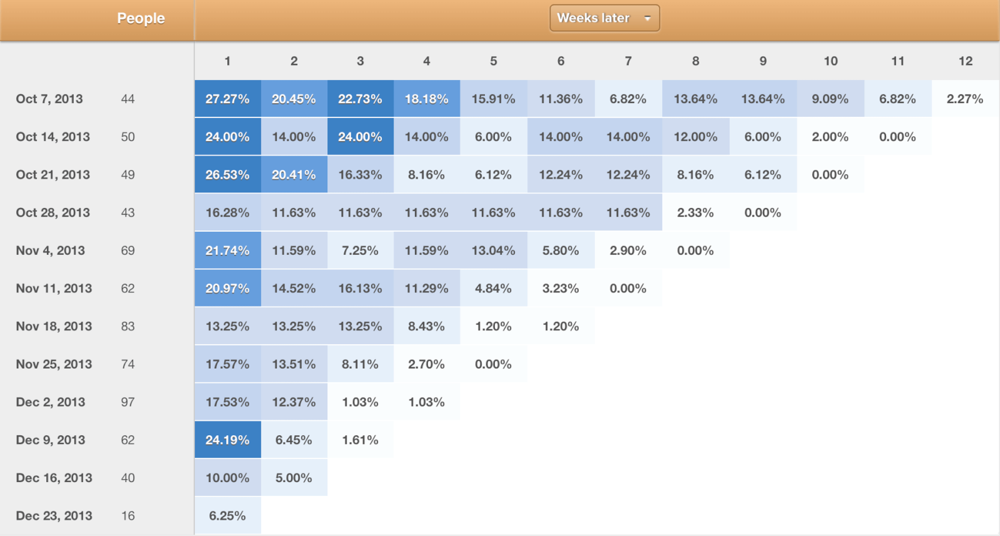
Here’s an example of a weekly cohort analysis in Mixpanel. In this chart, you can observe the engagement levels of each cohort over time as measured by week. For example, of the 44 people who joined the week of October 7th, 2013, 2.27% were still engaged (color-coded below as a sort of “heat map” with shades getting lighter) 12 weeks later:
credit: Mixpanel
The two trends we like to see in cohort analyses are:
1. Stabilization of retention in each cohort after a period such as 6 or 12 months. This means you are retaining your users and that your business is building a progressively larger base of recurring usage.
2. Newer cohorts performing progressively better than older cohorts. This typically implies that you are improving your product and its value proposition over time — and also gives us an indication of the team’s capabilities.
#11 Registered Users
Commenters pointed out the absence of this metric in the first post we published. And in some businesses, the number of registered users (as a proxy for engaged customers) can indeed provide some useful signal.
But we often tend to discount registered users since we’ve seen multiple instances where it has been gamed, and growth in registered users did not lead to a growth in actual product usage. Also, registered users is one of those dreaded “cumulative” metrics that can go up-and-to-the-right even when a business is shrinking.
So in most cases our preferred user metric is active users, which is more indicative of actual product use — and often translates directly to revenue potential over the long term. Read on for more about measuring and reporting on active users…
#12 Active Users
What does “active” users really mean? Inquiring minds want to know! But there is no single answer, since the definition of active user really varies by company; it depends on the business model. For instance, Facebook defines “active” as a registered user who logged in and visited the site via any device, or as a user who took an action to share content or activity with Facebook friends via 3rd-party sites integrated with Facebook.
The important things to remember when measuring your active users are to: (1) clearly define it; (2) make sure it’s a true representation of “activity” on your platform; and (3) be consistent in applying that definition.
Here are a few other examples of how companies define active users for their general categories of business…
…on social sites
In social and mobile platforms, common metrics of measure for activity are MAUs (monthly active users), WAUs (weekly active users), DAUs (daily active users), and HAUs (hourly active users).
When evaluating social businesses, we look carefully at the ratios of these metrics — e.g., DAUs-to-MAU or WAUs-to-MAUs — to get a sense of user engagement. The most valuable social properties typically demonstrate high relative engagement rates on all these ratios.
…on content sites
A common measure of active users and activity on all kinds of content-based sites has been “uniques” (monthly unique visitors) and visits (pageviews or sometimes “sessions” if defined at a minimum period of complete activity). While there is much debate about the merits and tradeoffs of each — which ones are more accurate, revealing, etc. — the key is to optimize for the measure that matters for your business, and that you can actually do something with. For example, as media sites and types of advertising have evolved, some sites and advertisers may care more about true engagement as measured by time on site, repeat visits, shares, number of commenters/comments, uptake in content, results of sentiment analysis, or other such metrics.
While the metrics depend on your business goals and what moves you’re trying to optimize for, we tend to look at both uniques and visits/sessions, since the former reflects the size of the audience (and if growing through new visitors brought in every month), and the latter reveals stickiness (though for engagement, time on site is perhaps still best). The very best businesses have both: large, growing audiences that are highly engaged.
…on e-commerce sites
We don’t typically place a lot of weight on active users in most e-commerce businesses. These businesses have a much more telling metric — actual revenue (and gross margin) — so then “show me [us] the MONEY” by showing total revenue, revenue per user, average order size, repeat usage, gross margins, return rates, and other measures that tell us about the transactions per visitor rather than the number of visitors.
How many users visit the company’s properties could provide a modest indication of their conversion efficiency, but this is also impacted by other factors like how much of their traffic comes from mobile — which typically converts at significantly lower rates than the website, at least for now.
#13 Sources of Traffic
You — and we — don’t want all your revenues to be driven by a single source; it’s the online equivalent of putting all your eggs in one basket. This is because the economics of customer acquisition can change over time (for example, Facebook mobile ads generated strong returns for companies early on but costs got quickly bid up); the channel could elect to compete for that same traffic (Google adding its own sponsored links in the search engine results page); or the channel partner could change its policy in a way that results in a dramatic, material reduction of traffic.
This is why it’s key to differentiate between sources of traffic — i.e., whether direct or indirect — because it reveals platform risk (dependence on a specific platform or channel). This is very similar to customer concentration risk, defined below. More importantly, the ability to differentiate traffic reveals your understanding of where your customers are coming from, especially if your goal is to build a standalone destination brand.
Direct traffic is traffic that comes directly — i.e., not through an intermediary — to your online properties. Users going directly to Target.com (as opposed to buying Target products on Amazon.com) are direct users. Users searching for specific items on Google and arriving at a website like Target.com or Amazon.com are not technically direct users. But this definition does get tricky as Google searches that include your brand in the search term can be considered direct traffic in some ways, because many people don’t bother typing in URLs anymore!
Organic traffic definitions vary. SEO experts and certain marketing-analytics providers define “organic” as purely unpaid traffic from search results. Others define it more broadly as the opposite of anything paid or paid sources, in which case it would include direct traffic as defined above; traffic that came from search results for specific keywords; and even traffic generated via retention marketing efforts (such as emails to their existing customer base) … as long as it’s all “free”.
There is no right or wrong definition for organic traffic. It is just important for you to track and understand it as distinct from other channels, so you can see where customers come from and where to focus your existing or new customer efforts. But we do get a little more excited when we see a company with a high proportion of direct traffic.
A hitch: An important nuance to be aware of when considering traffic sources is the existence of “dark social”, as coined by tech editor Alexis Madrigal. This term describes web traffic that comes from outside sources or referrals that web analytics are not able to track, for example, users coming in via a link shared over email or chat. [Some sites just started clumping people pursuing links outside the homepage and landing page as “direct social”.]
Finally, another nuance to be aware of when considering traffic is the difference between search engine optimization (SEO) and search engine marketing (SEM), because they are sometimes used interchangeably even though they are different: SEO is the process of optimizing website visibility in a search engine’s “unpaid” results through carefully placing keywords in metadata and site body content, creating unique and accurate content, and even optimizing page loading speed. SEO impacts only organic search results and not paid or sponsored ad results. SEM, on the other hand, involves promoting your website through paid advertising or listings, whether in search engines or promoted ads in social networks. SEO and SEM are thus complementary not competing services and many businesses use both.
#14 Customer Concentration Risk
In keeping with the “don’t keep all your eggs in one basket” theme, we often look at customer concentration when evaluating enterprise businesses.
Customer concentration is defined as the revenue of your largest customer or handful of customers relative to total revenue, with both revenues reflecting the same time period. So if your largest customers pay you $2M/year and your total revenue is $20M/year, the concentration of your largest customer is 10%.
As a rule of thumb, we tend to prefer companies with relatively low customer concentration because a business with only one or few customers runs a number of risks. Besides the most obvious one of the customer(s) moving their business elsewhere, which creates a large revenue hole, the risks include the reality that:
— The customers have all the leverage over pricing and other key terms
— The customers may unduly influence the product roadmap, sometimes demanding features unique to only their needs
— The customers use their importance to force the company to sell to them at below-market terms
There is a flip side here, however: In some industries there are relatively few customers, but those customers are gargantuan. Industries with these characteristics include mobile phone carriers, cable networks, and auto companies. Very successful companies can be (and have been!) built supplying to these industries, but they tend to have a higher degree of go-to-market risk because the small number of buyers know how to exercise their power — which you’ll see in metrics such as median time to close a deal, discount from list price, number of approvers (including the dreaded procurement department), and cost of sales.
Presenting Metrics Generally
#15 Truncating the Y-Axis
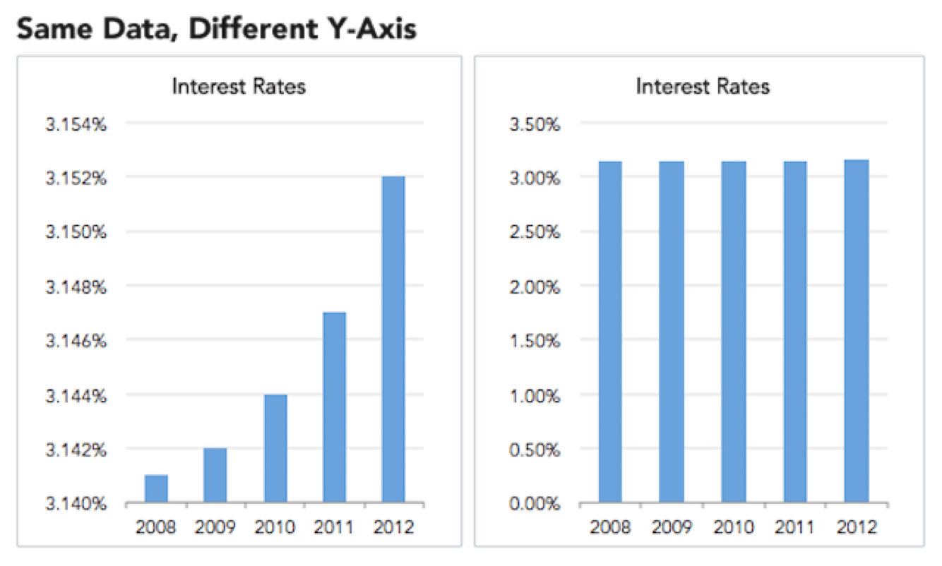
Please do not do this when presenting data for evaluation.
Here’s a less tongue-in-cheek example of why changing the data range in y-axis to “zoom in” on differences is misleading, as originally presented by Ravi Parikh in Gizmodo. The zero baseline below (right) shows how interest rates are not, in fact, skyrocketing (left):
[Another interesting concept to be aware of when considering baselines — especially when considering historical and multi-generational data — is the notion of shifting baselines.]
#16 Cumulative Charts, Again
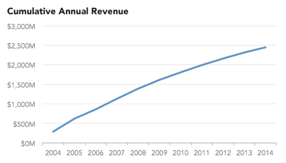
We mentioned the problem of cumulative charts in our previous post, but a related issue is presenting metrics that are not supposed to be cumulative in a cumulative chart.
For example, please do not do this (also originally presented by Ravi Parikh here)…
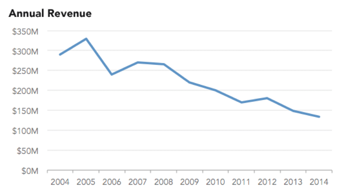
…when this is what’s really going on:
Metrics that should never be reported in a cumulative fashion include revenue, new users, and bookings. Bottom line: if you are reporting something in a cumulative fashion, make sure you can explain why that’s material and why it’s appropriate to measure your business that way.
Editor: Sonal Chokshi @smc90
