Forget gamification. If you want to make software that feels like play, rather than work, it requires tapping into deeper, more intrinsic motivations. And that’s where the principles of game design come in. In this talk from the the 2019 a16z Summit (full transcript below), Rahul Vohra, the Founder and CEO of Superhuman, shares his theory of game design for building satisfying products in any industry that retain and delight users. He distills elements of psychology, storytelling, mathematics, and interaction design into seven principles that will give users an experience that’s rewarding, fun, and productive.
Show Notes
The reason business software today feels like work [0:50]
Why game design is not gamification [1:12]
The 5 factors Rahul uses when designing games [3:06]
Defining concrete goals for your products [3:44]
Exploring models to design emotion into your products [5:08]
Creating rapid and robust controls for business software[7:24]
Why the best games include toys [8:46]
Demo of Superhuman’s favorite toy — the time autocompleter [9:03]
Rahul defines flow and how to achieve it [10:56]
Why flow depends on balancing challenge and skill [13:50]
Summary of Rahul’s 7 Principles of game design [15:22]
Transcript
Good afternoon, everybody. I’m Rahul. I’m the founder and CEO of Superhuman, where we make the fastest email experience in the world. Our customers get through their inbox twice as fast as before, reply to their important emails sooner, and many see inbox zero for the first time in years.
Now, Superhuman is productivity software, but I’m really a gamer at heart. And I’m here to share how you can apply game design to business software.
Today, our business software feels like work. You have to do your email. You have to submit your expense reports. You have to enter data in your CRM. But what if we could make it less like work and more like play? With game design, we can.
I will shortly share what game design is. But first, let me say what it isn’t. Game design is not gamification. It is not simply taking your product and adding points, levels, trophies, and badges. Ten years ago, gamification was a big deal, but it didn’t work. And to understand why, we have to understand human motivation.
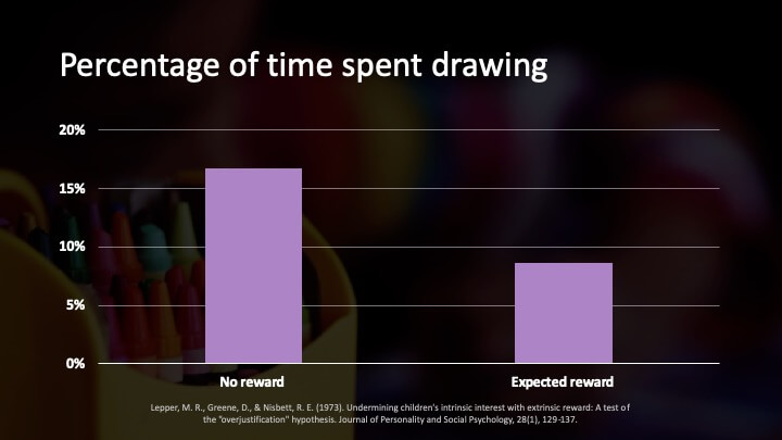
In the 1970s, Stanford researchers recruited 50 kids, ages 3 to 4. All of these children were previously interested in drawing. Some of the kids were told they would get a reward, a certificate with a gold seal and a ribbon. The other kids weren’t told about a reward. They didn’t even know one existed. The children were then invited into separate rooms to draw for six minutes, and they would either get a reward or not.
Over the next few days, they were observed to see how much they would continue to draw by themselves. The children who didn’t get a reward spent 17% of their time drawing. But the children who did get a reward only spent 8% of their time drawing. The reward had halved their motivation.
So, what’s going on here? Well, researchers distinguished intrinsic and extrinsic motivation. With intrinsic motivation, we do things because we find them inherently satisfying and interesting. With extrinsic motivation, we do things to achieve rewards. And that’s the problem with rewards – they massively undermine intrinsic motivation. This is also why gamification does not work. When gamification appears to work, it is because the underlying experience is already a game.
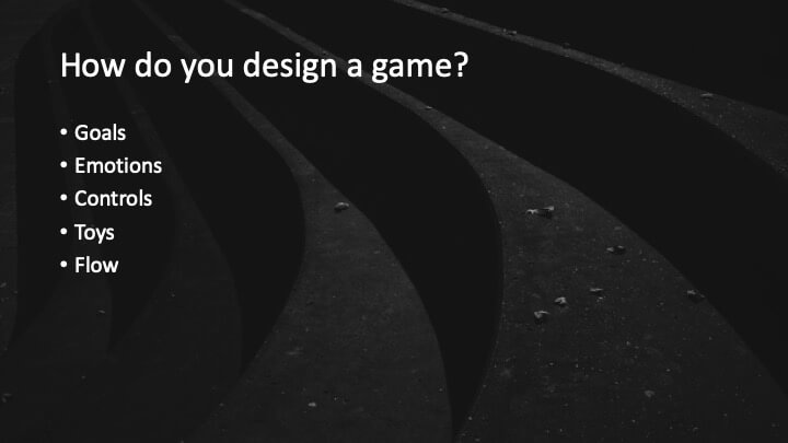
That brings us to the question, how do you design a game? This is a question that I have been obsessed with for a long time. As a kid, I learned how to code just so I could make my own games. Before I was a founder, I worked as a game designer. And now as a founder, I’ve gone deep into the theory of game design. As it turns out, there is no unifying theory of game design. To create games, we have to draw upon the art and science of psychology, mathematics, interaction design, and storytelling. These are five factors to consider. For each of these factors, I’m going to share how we use it at Superhuman and how you can use it in your own products.
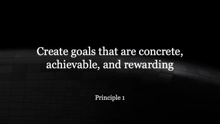
Games need goals. In fact, goals are a defining feature of games, but we can’t just have any goals. We need good goals that are concrete, achievable, and rewarding.
At Superhuman, we set a very concrete goal: get to inbox zero. But the goal must also be achievable, which is why we onboard our users. For each new user, we do a live concierge onboarding. This is a one-to-one 30-minute video call with one of our wonderful onboarding specialists. We teach faster workflows to get to inbox zero. We show powerful shortcuts so you never have to touch the mouse. And if you’re far away from inbox zero, we’ll wipe the slate clean so that you’re close, thus making the goal more achievable.
But the goal must also be rewarding. When you hit inbox zero, you feel triumph over your email, a previously rare and incredibly rewarding experience.
Most business goals aren’t clear. Business software does not have clear goals. And if they are clear, they are usually unrewarding and unachievable. This brings us to the first principle of game design. If you want to make software like a game, then create goals that are concrete, achievable, and rewarding.
Now, the best games create strong emotions because emotions are the foundation of our memory. We must, therefore, be able to analyze emotion. To do that, we need vocabulary.
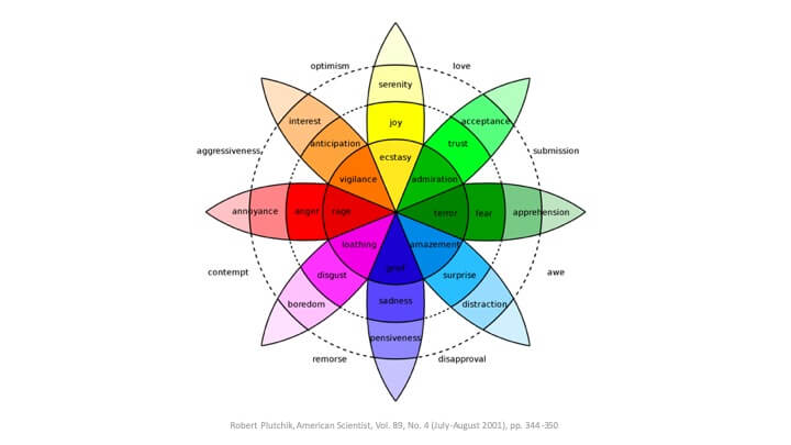
There are many models of human emotion. The most famous is Plutchik’s wheel. Plutchik identified eight core emotions. Opposite emotions across from each other. For example, joy is opposite from grief. You can blend adjacent emotions to create new complex feelings. For example, when you combine joy and anticipation, you get optimism. When you combine joy and trust, you get love.
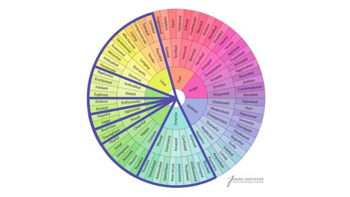
But as game designers, we need a much richer vocabulary than academia provides. The emotions we are aiming for are much more nuanced. This is the most useful model I have found by the Junto Institute, and it contains the subtleties that we need to care about.
At Superhuman, we care deeply about joy. We design for enthusiasm and excitement. Our users come to us super excited to use the products. We design for hopefulness and optimism. Our users really want Superhuman to improve their lives. We design for pride and triumph, for when you hit inbox zero, especially if it’s the first time in years, you rightly feel like you accomplished something special.
When you do hit inbox zero, we show you stunning and gorgeous imagery. We do this to widen our emotional repertoire beyond joy into love and surprise. We show images that are serene and peaceful, images that create a sense of longing and sentimentality, images that even amaze and inspire a sense of awe.
You can also use the wheel to find emotions to remove. Many people come to us with negative feelings about their own email. They may feel helpless, anxious, annoyed, guilty, even powerless. This brings us to our second principle of game design: design for nuanced emotion.
Controls can be one of the main reasons why a game succeeds. Consider the Wiimote. The original Wii sold over 100 million units, and every controller since incorporated motion. But games require much more robust controls than we typically build for business software. Imagine you’re playing a game like “Street Fighter.” It would be incredibly frustrating if the game ignored half your inputs, and your character flopped around, and then you died. But that is the status quo for business software today.
Let’s say I want to email my co-founder, Conrad. In Gmail, the shortcut to compose an email is C. So I hit C, and then I type Conrad. In Gmail, if I do this too fast, I end up with two drafts, and I’m sending an email to Rad. In Superhuman, we pipeline our keystrokes so this can never happen. In case you think I’m picking on Gmail, this kind of error is status quo for business software today.
This brings us to our third principle of game design: create rapid and robust controls.
Are toys the same as games? We play with toys, but we play games. A ball is a toy, but baseball is a game. As it turns out, the best games are made with toys. And then they are fun on multiple levels, the level of the toy and of the game itself.
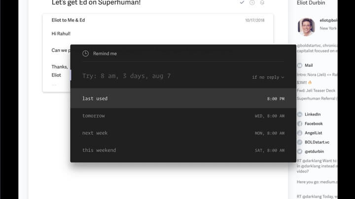
In Superhuman, a favorite toy is the time autocompleter. You use this to snooze your emails. You can type in whatever you want. It may be gibberish, and it will do its best to understand you. For example, 3D becomes three days; 3H, three hours; 1MO, one month.
The time autocompleter is fun because it indulges playful exploration. What does it do? How does it work? When does it break? It’s not long in onboardings before people start trying to do things like this. Well, I wonder what happens if I keep on typing 10? Well, it turns out that’s October the 10th at 10:10 p.m. Or what happens if I put the p.m. in the middle? Well, it seems like that still works. What happens if I type out a sequence of twos? Well, that’s February the 2nd, 2020 at 2:00 p.m.
And then you might start to try more complex inputs. How about in a fortnight and a day? It’s not long before you find pleasant surprises. For example, you never have to do time zone math again – 8:00 a.m. in Tokyo, no problem. That’s 8:00 p.m., Eastern. Many of our users are delighted to find that if they really want, they can snooze an email until never.
Principle four: make fun toys and then combine them into games. Consider your own product. Is it fun, even without a goal? Does it indulge moments of playful exploration? Does it create moments of pleasant surprise? If so, congratulations because then you have a toy and you’re on the way to building a great game.
Now, the previous four factors are critical to game design. Flow is perhaps the least understood. Flow is the intense and focused concentration on the present. Flow is so absorbing that we don’t worry about the past or think about the future. Flow is so demanding that we don’t care about what others think about us. Flow is so easy that we always know what to do next. Flow is so powerful that we lose track of time. It can either flash by in an instant or stretch out for infinity. And flow is so rewarding that our activities become intrinsically motivating, which as we know from earlier, is the most powerful and effective form of motivation.
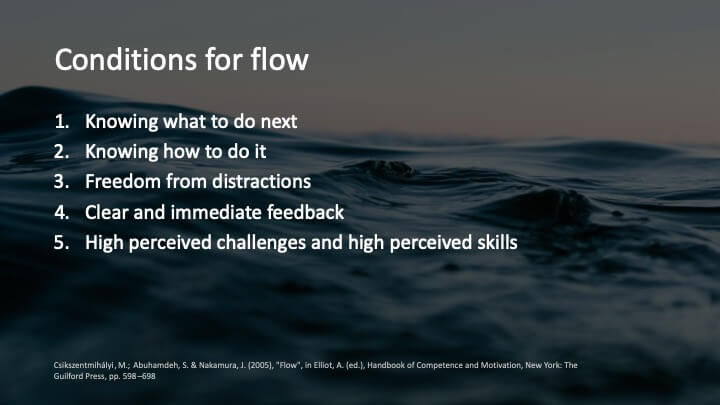
In other words, flow is incredible. How do we make it? Well, these are the conditions:
1. You must always know what to do next.
2. You must always know how to do it.
3. You must be free from distractions.
4. You must get clear and immediate feedback.
5. And this is the hardest to get right. You must feel a balance between challenge and skill.
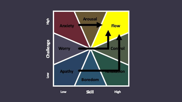
We can visualize the relationship between challenge and skill with the experience fluctuation model. If the activity is too hard, you’ll feel anxious. If the activity is too easy, you’ll feel relaxed or bored. To truly feel in flow, you need to perceive a high challenge and match it with high skill.
So, how do we create flow in Superhuman? Well, let’s take these conditions one by one.
Number one: knowing what to do next. You can make product decisions that make this dramatically easier for your users. In Gmail, when I archive this email, I end up back on the inbox. I now have to decide what to do next, and I have to do this every single time. This destroys flow. In Superhuman, when I archive the same email, I immediately see the next one. I don’t have to make any decisions at all. This creates flow.
Number two: knowing how to do it. Early on, we saw that users would forget our shortcuts. They knew what they wanted to do, but they didn’t know how to do it. So, we built Superhuman command. Simply hit command K, enter what you want to do, and not only will it do it for you, it will teach you the shortcut for next time.
Next up: freedom from distractions. In Superhuman, you can only see one conversation at a time, and you cannot see the inbox at the same time as the conversation. And so, quite deliberately, you can’t see what’s coming next or any new email. You can design your interfaces like this to reduce distraction and so create flow.
And the thing I’m most excited to share is this balance between challenge and skill. This is the experience fluctuation model. For most people, Gmail is the left-hand slice. Some people feel apathetic or worried. Their skill level is low-to-medium, but their email doesn’t matter that much. Some people feel further up the left-hand side. Their skill level is low-to-medium, but their email does matter. Many people feel anxious. The skill level is low-to-medium, but their email really does matter, and they are failing at it. This is actually how most users come to us.
At Superhuman, we massively increase the skill level for almost everybody. But what happens if your email wasn’t that challenging to begin with or you are already highly skilled? Well, then, and this is going to sound crazy, we increase the challenge level. We give you a really challenging goal: hit inbox zero without ever touching the mouse. This balances your perceived skill with the perceived challenge, thus resulting in flow.
Flow is so important that it actually gives us three principles: make the next action obvious, give clear feedback immediately and with no distraction, and balance high perceived skill with high perceived challenge. This may counterintuitively mean making your products harder to use.
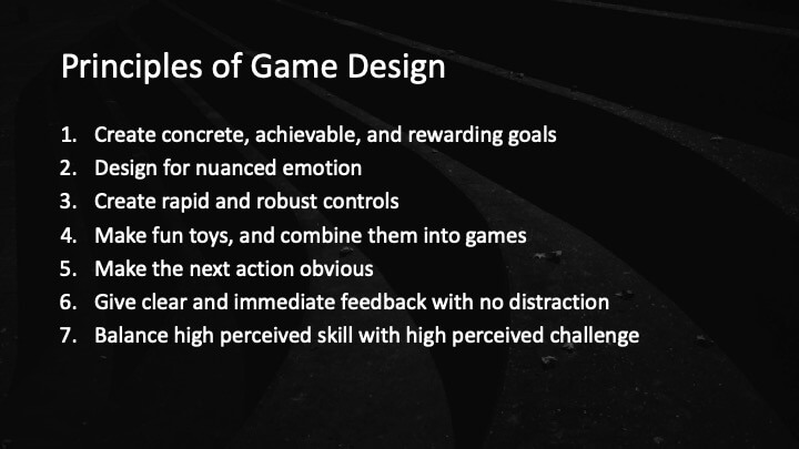
These are our seven principles of game design. If you follow these, your users will be intrinsically motivated. They will use your products, not because they have to, but because they find it inherently interesting and satisfying. With these seven principles, you can create products that are delightful, amazing, magical, and which fundamentally are games.
