When a new social app starts to “work,” it feels like magic, but often looks like a black box.
What causes a product to take off, and then continue to pick up steam—to the point where millions of people are using it daily for years to come?
This is especially tricky because most social apps don’t look like much in the early days. Facebook started as a way for Harvard students to rate their classmates as “hot or not,” and Snapchat was seen as just a sexting app in its early days. Success in the consumer social space can feel random.
After years of leading growth at Snap and two years making investments at a16z, I’ve formed a different view about why certain products take off. Yes, developing a truly great social product can feel like trying to catch lightning in a bottle. But once a product is “out in the wild,” assessing its performance—and potential—is a bit more scientific than people think. A few early data points tend to predict whether a social app will plateau at 10,000 active users or go mainstream with millions of users.
Here are the metrics that I look for in early stage consumer social products—as well as how to measure them.
TABLE OF CONTENTS
TABLE OF CONTENTS
Growth
When benchmarking growth, you first need to define your core metric. For most consumer social apps, this is daily active users (DAUs), as you want to have people using your product every day. For apps with a less frequent use case, weekly active users (WAUs) is also acceptable as a starting metric. You’ll eventually need to upgrade to DAUs if you want a shot at securing a coveted slot on the home screen, i.e., “the most important real estate on your phone,” as Mark Zuckerberg has put it.
You’ll want to see this core user metric growing—maybe not with perfect consistency, but when you look back at your graph the trend should be “up and to the right.” Many social apps may see step-change spikes in growth (e.g., the app goes viral and gets 50k new downloads in a day!), but to truly unlock acquisition, you’ll want to see growth that lands around or above some baseline level almost every month. This sometimes “spiky” growth is also why it’s important to have excellent retention (more on this below), so you can capitalize on viral moments and retain those users.
Based on a16z’s private benchmarks of hundreds of early stage social apps, here’s what OK, good, and great look like for monthly user growth in seed-stage consumer social companies:
- OK – 20%
- Good – 35%
- Great – 50%
Ideally, all or almost all of this growth comes organically. There’s a practical reason for this. Social apps often can’t monetize until later, so they don’t have as much cash to burn on paid marketing. More intuitively, social apps should be inherently viral, with users wanting to invite their friends to make the experience even better. If this isn’t happening, there may be more to unlock in the product.
Many social apps experiment with some paid marketing in the early days, either to acquire an initial user base or to test the app with influencers or ambassadors. However, if more than 10-20% of your users are coming from paid sources at the early stages, you’ll likely want to rethink your acquisition strategy. No amount of marketing dollars can fix a product, so make sure that your growth is coming from the product itself.
TABLE OF CONTENTS
TABLE OF CONTENTS
Engagement
Growing your user base is great, but you also need to look at how these users are engaging with your product. There are a few ways we analyze how engaged a social app’s user base is.
First, we look at engagement ratios, the most popular of which is DAU / MAU. Of your monthly active users, how many are also in the app every day? The higher this number is, the better. Here’s how we benchmark DAU / MAU:
- OK – 25%
- Good – 40%
- Great – 50%+
Other ratios here are daily to weekly active users (DAU / WAU) and weekly to monthly active users (WAU / MAU), but we see DAU / MAU as the most important.
However, while these ratios are helpful, they don’t capture an important nuance: the behavior of your power users. Enter… the L-ness curve! This metric looks at the distribution of users by number of days active over a certain time period, and can be measured on either a weekly or monthly basis. For example, on a weekly basis, how many of your WAUs are active one day per week, two days per week, three days per week, and so on.
Best-in-class social apps have an L-ness curve that “smiles,” or even better, has a “crooked smile” that skews right. Similar to the DAU / MAU ratio, this means that users are making your product a regular part of their life.
One way to interpret your L-ness curve is to look at how many users are at or above a certain level of engagement. For a weekly L-ness curve, we often look at L5+, or how many users are in the app five, six, or seven days a week, as this indicates a near-daily use behavior. Here’s how we benchmark L5+ performance:
- OK – 30%
- Good – 40%
- Great – 50%+


TABLE OF CONTENTS
TABLE OF CONTENTS
Retention
For social apps, the rubber hits the road at retention. It’s the lifeblood of an app, and the hardest metric to “game”. Having tried to increase the retention rate during my time at Snap, I can assure you that improving the day 30 (d30) retention even 1% at scale was an incredible feat.
One primary metric matters with retention: – n-day retention, which is also known as bounded retention. This strict definition looks at what percentage of an original cohort enters the app on each specific day. For example, d7 retention for users in cohort A is calculated as:
(Users in cohort A who entered the app specifically on d7) / (Users in cohort A)
The alternative to n-day retention is unbounded retention. This looks at how many users entered an app up to and including a specific day. Unbounded d7 retention would be calculated as:
(Users in cohort A who entered the app sometime between d1 – 7) / (Users in cohort A)
We find unbounded retention to be less valuable in short-term measurements, as it’s fairly idiosyncratic between companies. For example, 50% unbounded d7 retention could mean that 50% of users are coming back on d1, and no one is coming back d2 – d7. Or, it could mean that 7% of users are coming back each day. Both of these are clearly very different things in terms of user behavior.
For n-day retention, we focus on three primary points in time: d1, d7, and d30. These metrics tend to be closely linked. For example, the more users you can get to an “aha” moment in onboarding (d0), the more will come back on d1—and the more likely they will be to still be engaged on d7 and d30. Here’s how we benchmark n-day retention:
- OK – d1 50%, d7 35%, d30 20%
- Good – d1 60%, d7 40%, d30 25%
- Great – d1 70%, d7 50%, d30 30%
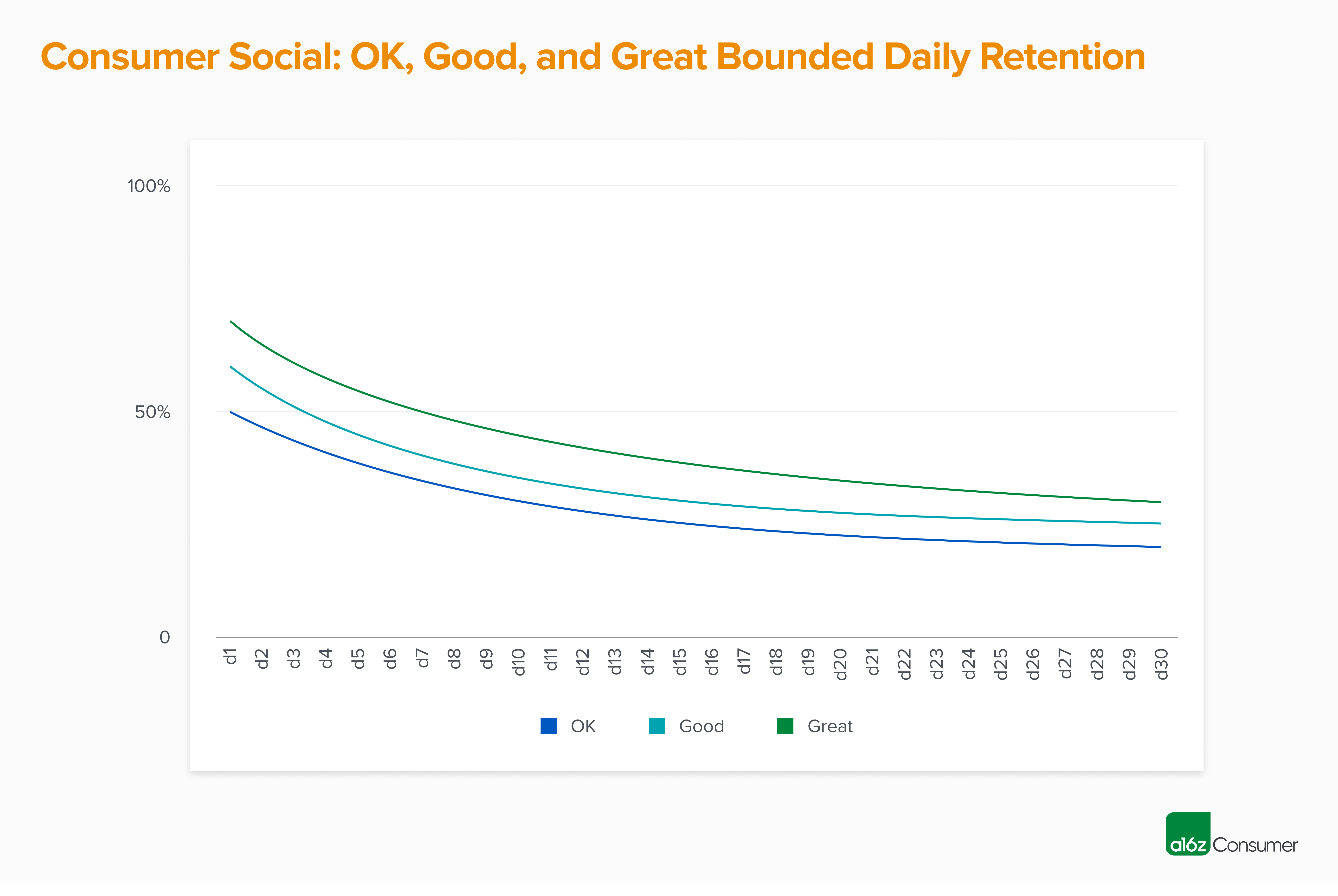
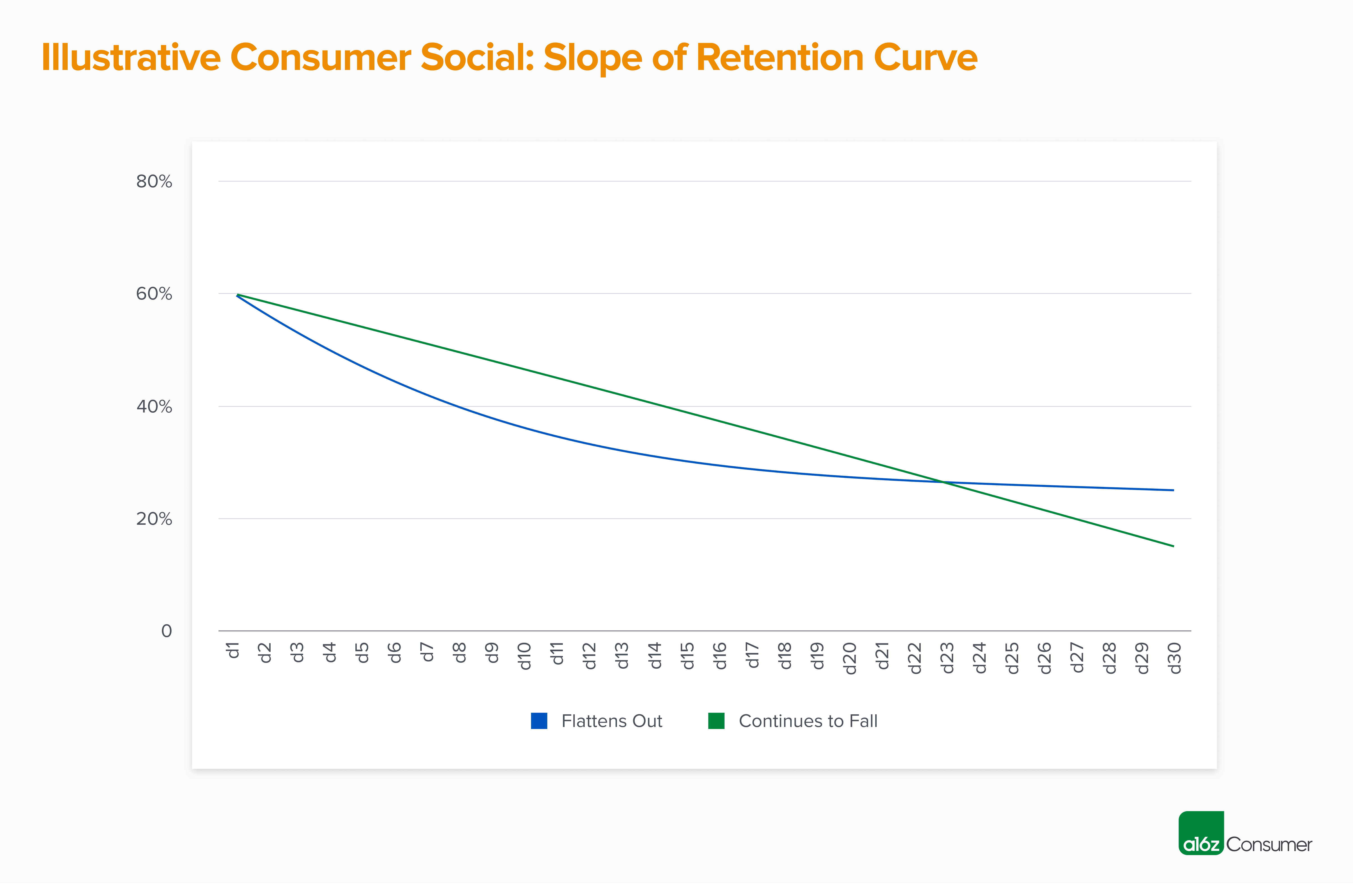
We also look at how quickly your retention curve flattens out. In the best possible case, you retain all your d1 users through d30, but we haven’t yet seen this in real data, as it’s almost impossible to accomplish. In most cases, we see the “slope of the line” start to flatten between d7 – d14, and hit a plateau by d20.
If there is a significant degradation of retention between, for example, d7 and d30, and your cohorts haven’t yet flattened out by d30, this can be an area of concern as it implies that your longer-term retention may not hold up. We see this most often for products that “juice” early retention via heavy early notification loads, which may work for the first few weeks but tend to become less effective over time.
For some consumer social apps, we also look at weekly retention. We do believe that the biggest social companies eventually become daily use case products, so index much more heavily on daily retention numbers. However, weekly retention can sometimes be relevant for companies that have built a tool that they’re transitioning into a network. To use Chris Dixon’s famous framework: Come for the tool, stay for the network.
Similar to daily retention, weekly retention is measured on a bounded, n-week basis. For example, w4 retention would be calculated as:
(Users in cohort A who entered the app sometime during week 4) / (Users in cohort A)
Here’s how we benchmark weekly retention:
- OK – w1 40%, w4 20%
- Good – w1 55%, w4 30%
- Great – w1 75%, w4 50%
TABLE OF CONTENTS
TABLE OF CONTENTS
Other
Beyond the metrics above, there are a few other things to keep in mind when looking at your consumer social app metrics:
- The higher your n count is, the more valuable your metrics are. While we love joining apps in TestFlight, we’ve found that metrics from very early adopters sometimes don’t hold up when an app is released “into the wild” for public use.
Why? Early users tend to be the highest engagement and the highest retention. This is either because they know the founding team (and want to support you!) or because they’re the best possible fit for your product (which is why they found you so early). We tend to find that a few thousand active users is where metrics start to be predictive of how an app will perform at scale.
- Similarly, the longer your time frame is, the more valuable your metrics are. When an app is first released, there’s often an early bump in users. This is particularly true if you’ve built a waitlist on platforms like TikTok and see a flood of registrations once the app opens up. This excitement tends to translate to strong early engagement and retention metrics, especially if you’ve done a good job building the hype around your company. Users will be very active for the first few days, or even the first few weeks.
However, social apps often take a few iterations to work, so it’s not surprising to see acquisition and engagement drop off sharply after this initial spike. This is another case where d1 to d7, or d7 to d30, retention degradation can be fairly stark. When possible, we like to see several cohorts of users hit at least that d30 retention mark, as this is a much more accurate indicator than the early numbers.
- Point-in-time numbers are great, but cohorts are even better! When evaluating social apps, we ask for almost all metrics over time, so we can see what the trend looks like. For example, instead of seeing your n-day retention data for the most recent cohort, or blended across all users, we’ll want to analyze this data on a monthly basis.
What we’re looking for is metrics that are stable, or even improve cohort by cohort. A good social app has strong network effects, which means that the product should be getting more valuable as more users join! If you’re not seeing this, it may mean that the product is struggling to scale beyond early adopters.
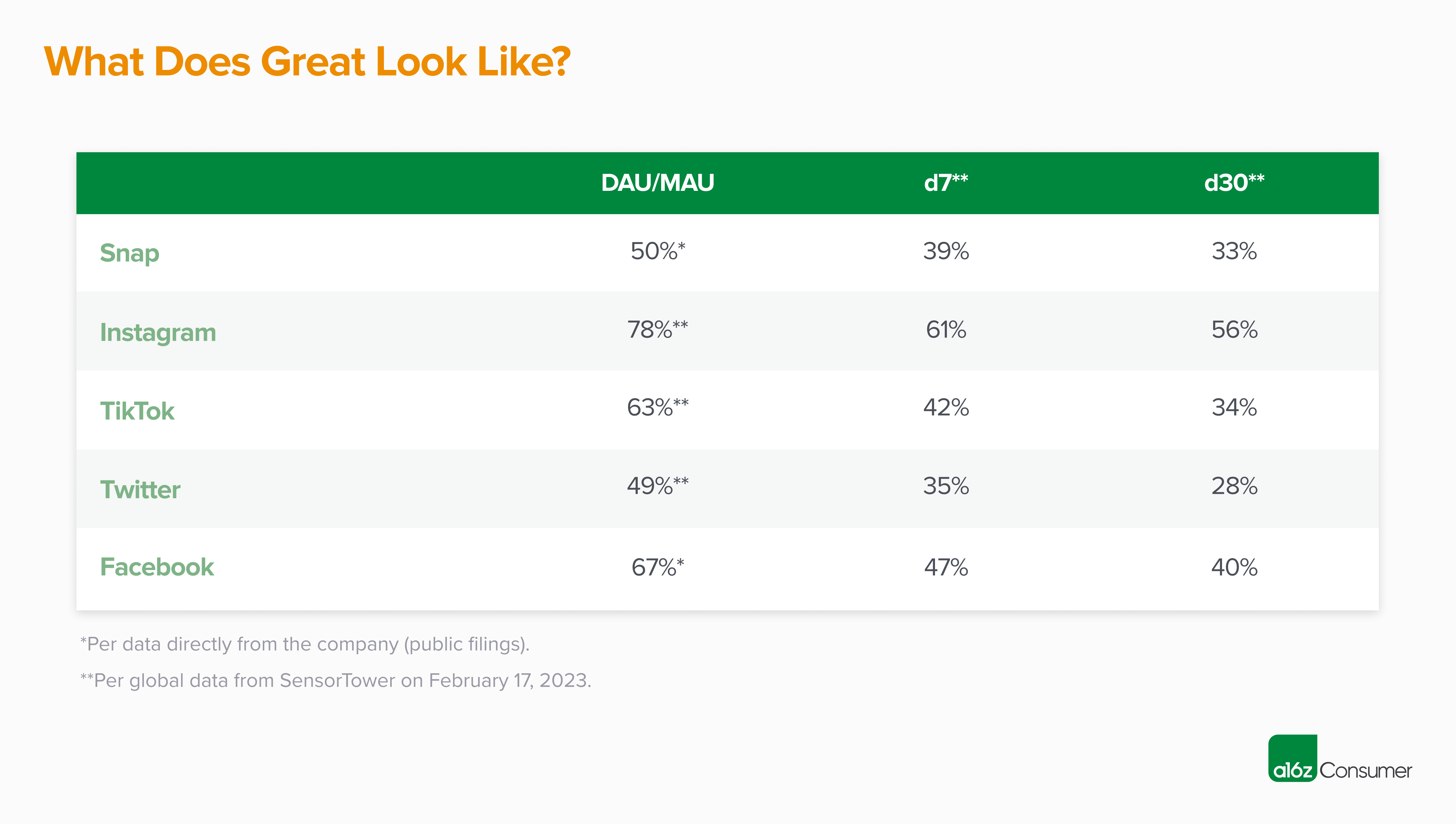
Thanks for reading! If you’re building a social app with metrics that track to our “great” benchmarks, as set by the most successful social app companies of the past 20 years and seen below, please reach out to bryan@a16z.com. I’d love to hear from you.
And if your metrics don’t fall into the “great” category yet, don’t be discouraged! We’ve seen (and invested in) many companies where the v0 (or even v5!) was not quite right…but the team kept iterating and eventually landed on a magical product. As a reminder, Facebook started as a “hot or not” style site called FaceMash, Twitter was originally a podcasting platform called Odeo, and Instagram was a hybrid check-in and photo-sharing app called Brbn. And before TikTok hit it big, there was Musical.ly!