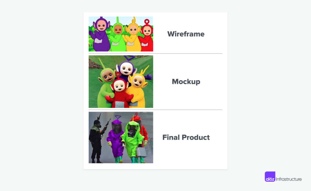
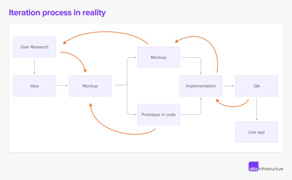
As former developers and product managers, we’ve lived the grueling dance between designers and developers, where questions such as “Is this design technically feasible?” and “Can you add another screen for this step?” take place in every meeting. All too often, this aspiring creative exchange resulted in a Jira-filled, time-consuming process comprised of iterations, compromises, and, ultimately, a disconnect between the designer’s vision and the developer’s execution.
In the last decade, however, advances in browser and frontend technologies have improved the process by leaps and bounds. Design teams adopted design systems and moved from local, single-player design tools to browser-based ones like Figma. Engineering teams have a wide swath of choices for frontend frameworks and libraries, such as Next.js, Flutter, shadcn/ui, and Tailwind. This all establishes a common ground where both the visual and the functional requirements can be met.
Today, more mature code-generation technology, coupled with advanced image models, has dramatically shortened the journey from a mere idea to a fully operational application. This improvement in efficiency opens a new era of possibilities, inviting generative AI into the heart of the creative process. In this article, we’d like to explore the fast-moving AI interface-design landscape and venture into some exciting possibilities that these technologies will unlock.
An example: AI-Tamago
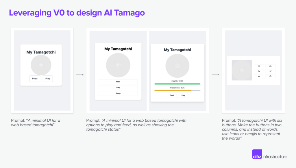
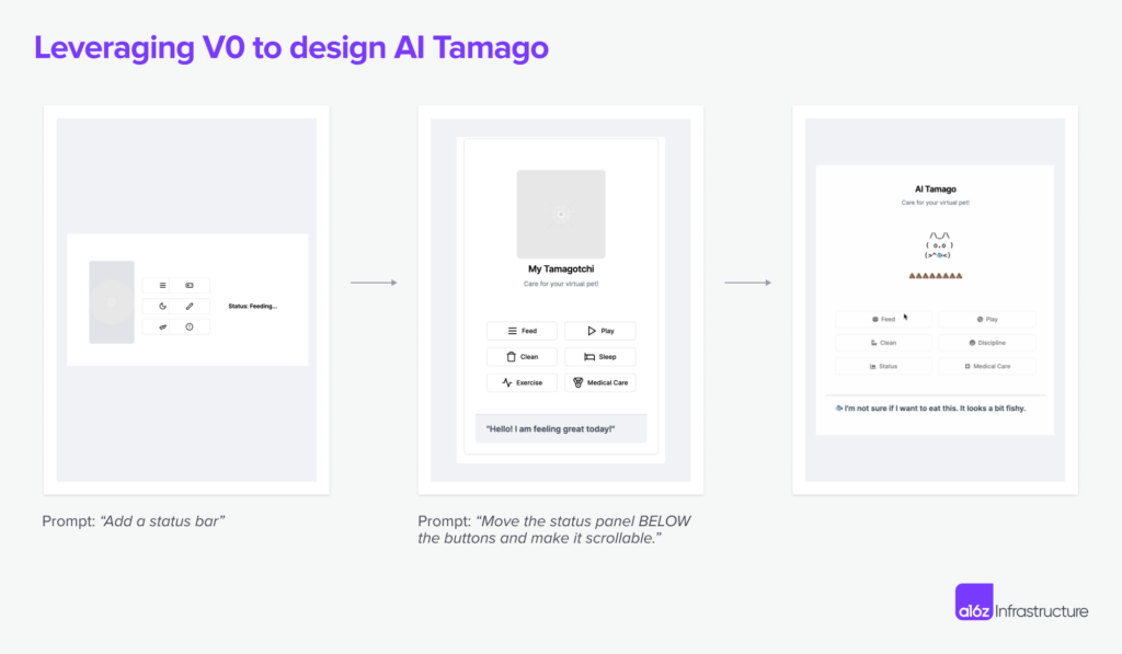
We were coding up a side project called AI-Tamago recently, and used generative tools like Vercel v0 extensively to design the UI.
The stages looked like what you see below. In each iteration, we added more details to describe what we wanted to see, sometimes reverting back to a different direction, while leveraging the LLM to surface good ideas we hadn’t thought of.
This whole process took about 30 minutes end to end. It’s much easier to go through these multi-step iterations between design and implementation when the designer and developer are a single person, which is the case for AI-Tamago. When collaborating with a team of designers and developers, the iteration process requires increased coordination and repeated revisions, consequently leading to a more complex and involved workflow.
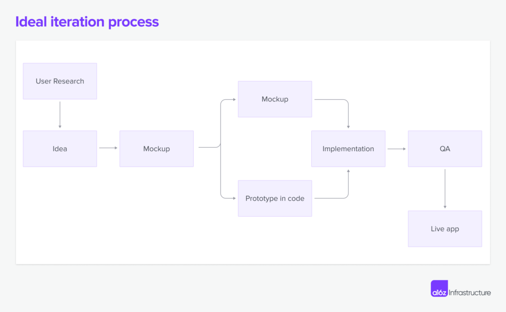
We spend a lot of time and energy filling in the gaps between what’s on the screen and what’s implemented in code. The problem is exacerbated when the app has complex states and edge cases, because it’s a huge undertaking for a designer to enumerate all the possibilities through screenshots. As a result, most of the issues are only caught during QA and testing, and require backtracking several stages to fix.
But because generative AI technology is uniquely fit for quick prototyping and code completion, we believe it can bridge a lot of the gaps in this iteration process.
The landscape of AI-powered interface creation
Today’s generative AI technologies unlock two major improvements. One is that LLMs act as a design sounding board. With each prompt resulting in a handful of mockups, the focus shifts from filling a blank canvas to inspiring creativity. For a designer, the process of fleshing out design becomes less about pixel manipulation and more about ideating. They can spend their mental energy on the usability and compositional part of design instead of having to make sure details align.
At the same time, the path from design to functional app has dramatically shortened, which enables rapid prototyping. Many tools here allow for quick creation of UI elements, from static assets to interactive components. There are now noticeably more “design engineers” — those who work at the cross-section of code and design, and can use working prototypes to communicate much more effectively the tradeoffs between design and implementation.
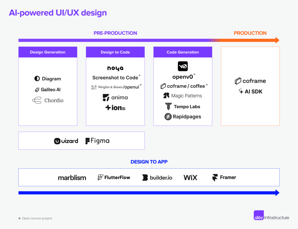
Under the influence of these two trends, we’re seeing a spate of tools emerge that revamp the design-to-implementation workflow.
The approaches we have seen can be categorized into three main functions:
- Solving for the design process
- Solving for design-to-code translation
- Solving for code generation
Let’s dive in!
Solving for the design process
The design process in itself is complex and non-linear, which is why giving designers better tools to do breadth-first-search and eliminate the need for pixel-perfect adjustments is very valuable.
Oftentimes, senior designers already have a few concepts in their brains upon hearing about the product features to be designed, and the rest of the work is aligning with other stakeholders on what the design would roughly look like, before producing a pixel-perfect mock-up. Some designers who are proficient in coding skip the need to produce a mock-up altogether and instead design in code.
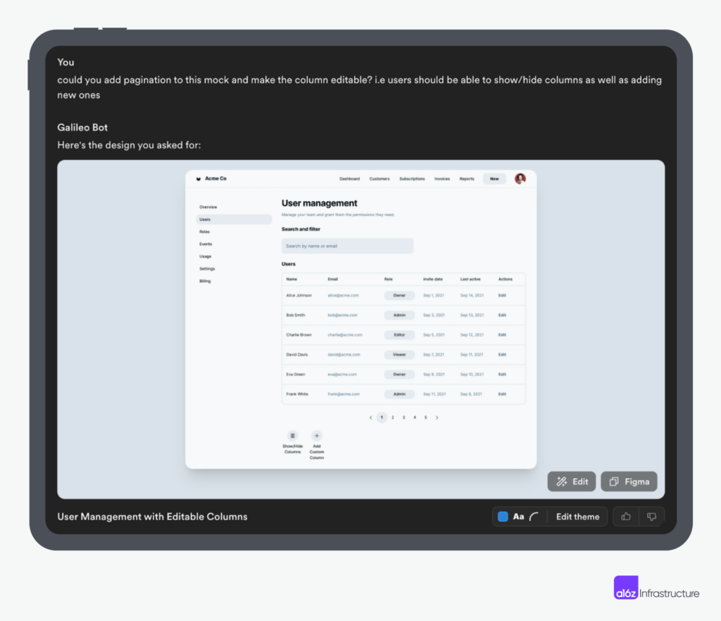
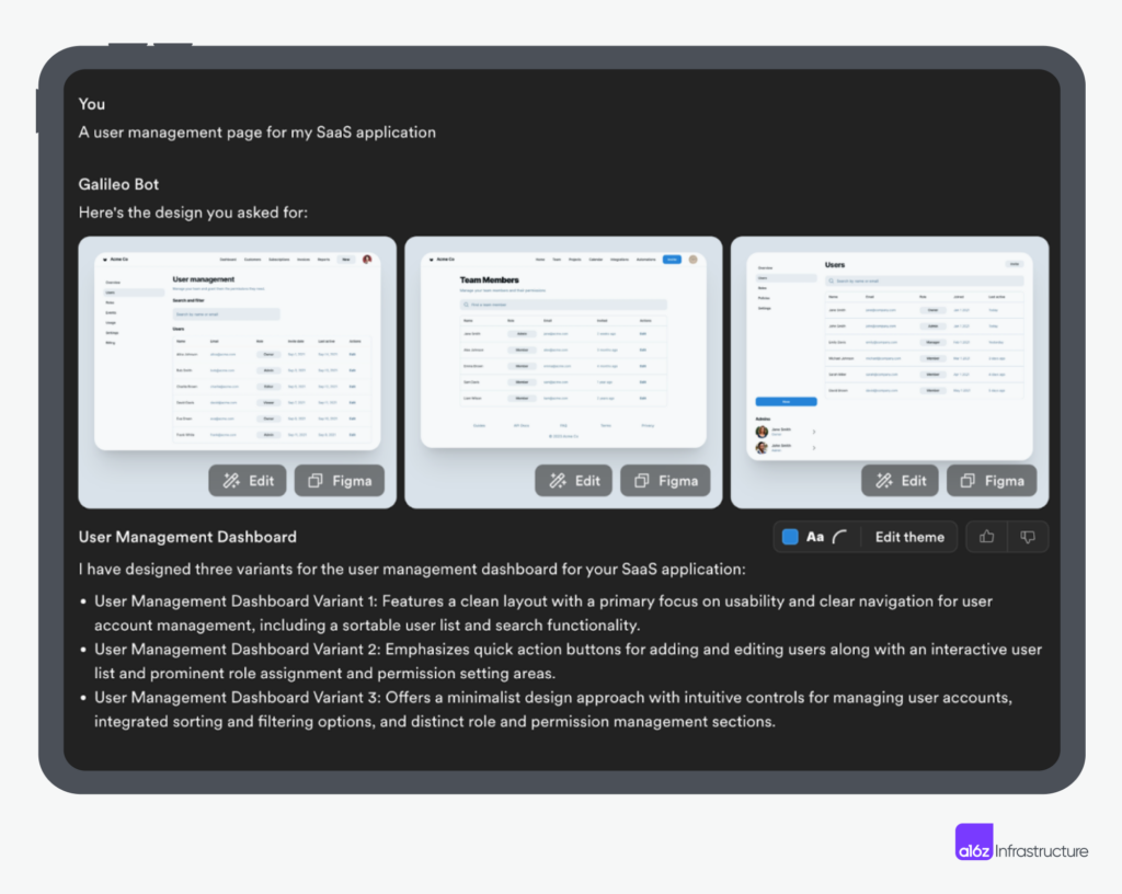
A “co-pilot for design” (like the example shown below using Galileo) makes this idea-to-mockup process more collaborative and interactive: Instead of drawing abstract ideas on a blank canvas, a designer could create new designs based on a rough idea and visualize it in a way that helps to explore the “unknown-unknown.”
Solving for design-to-code translation
This is arguably the most friction-ridden stage — it’s almost like translating from one language to another. Design and engineering speak different languages, and something always gets lost in translation. However, generative AI models, through their training or fine-tuning on diverse datasets, have developed an intricate understanding of programming languages, design principles, and UX guidelines. Coupled with their capacity to apply UI templates and frameworks like Tailwind, LLMs can now generate functional, aesthetically pleasing UI elements.
This capability is not just translating design concepts into code; it’s also doing it with an awareness of the latest trends, applying best practices, and leveraging existing frameworks.
As a developer, you may be wondering how deep this “translation” goes: Does it replicate only the style, but not the substance? What about the interactions that can’t quite be conveyed using static assets? If I design a login page, does the code generation know that I want to use a service like Clerk, or components from React Email?
Today, most solutions are centered around replicating the visual style. Although, as more component-as-service companies mature, or coding agents like Devin proliferate, it will be possible to directly integrate with well-defined functionalities and React libraries, further completing the cycle of design to functional apps. Especially if the problem is well-scoped or includes common UI elements, we may see fine-tuned models directly addressing the functionalities of these workflows.
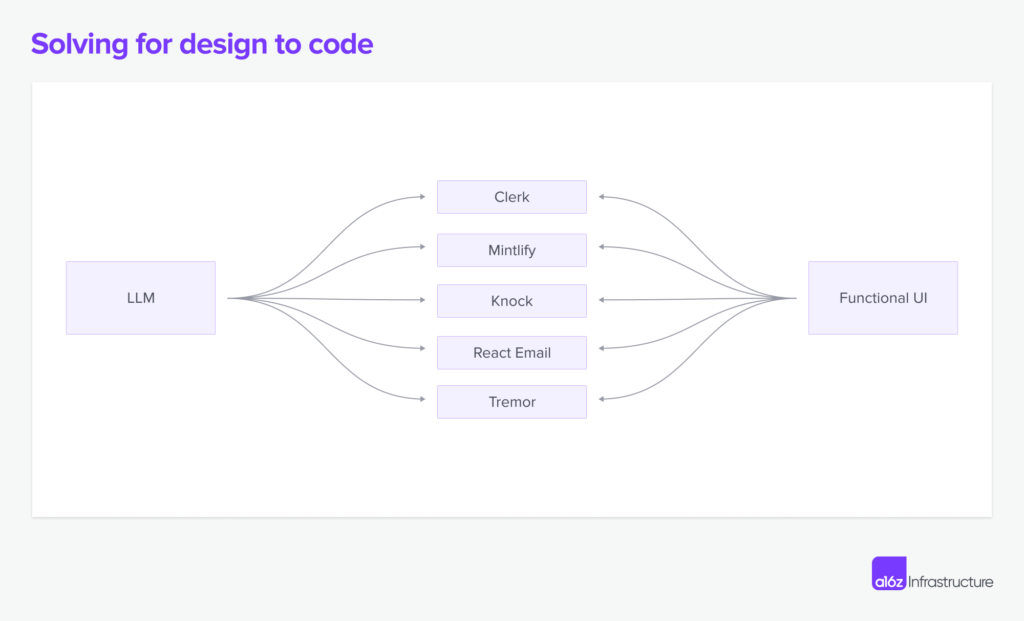
Use cases like authentication, user management, sending emails, notification, documentation, and display charts are common across most business applications. Thanks to vertically integrated components like Clerk, Mintlify, Knock, React Email (Resend), and Tremor, LLMs could leverage these ready-to-use components and generate UIs deeply integrated with the backend systems.
Solving for code generation
Design mock-ups and their implementations are never 1:1, which is why static mock-ups can only represent a limited set of information about what the eventual design should look like. When an engineer implements this design, they need to fill in the blanks on the feasibility and interaction dynamics, as well as aesthetics.
This is why many teams who want to move fast choose to treat code as the source-of-truths when designing new UIs: These teams translate design concepts into functional prototypes right from the start, transforming design problems into coding problems. This approach is especially beneficial for interaction-heavy products, or for projects that need fast iteration and testing. While this approach can never be as systematized, detail-oriented, or polished, it is uniquely fit for fast-moving startups or developer tools. By skipping certain design steps, LLMs can pull in relevant parts of an app with pre-existing component systems, making iterations on the final product much faster.
The market is still in its early days for solving the outlined problems, and it’s yet to be seen whether code generation with design scaffolding will be the answer; but we’re able to see products like V0, MagicPatterns, RapidPages, and others taking the first principled attempt at solving this problem.
Envisioning the future: dynamic and adaptive UI through generative AI
Beyond cool technology and efficiency gains for developers and designers, there also are some exciting advances in new software interfaces leveraging dynamic UI generation.
State-based dynamic UI
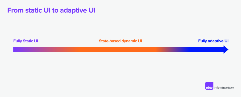
For example, existing interfaces are often direct reflections of the business logic. Although there is user-based A/B testing, the tests are hardcoded and require a lot of human intervention to set up and monitor. The ability of LLMs to reason and use tools is changing this.
We often hear the question: “What’s the right interface to interact with an LLM?” But the flipside of this question is more interesting in the realm of UI/UX design: “What data do we need to give to LLMs so they become the most helpful in deciding which existing interfaces to serve?”
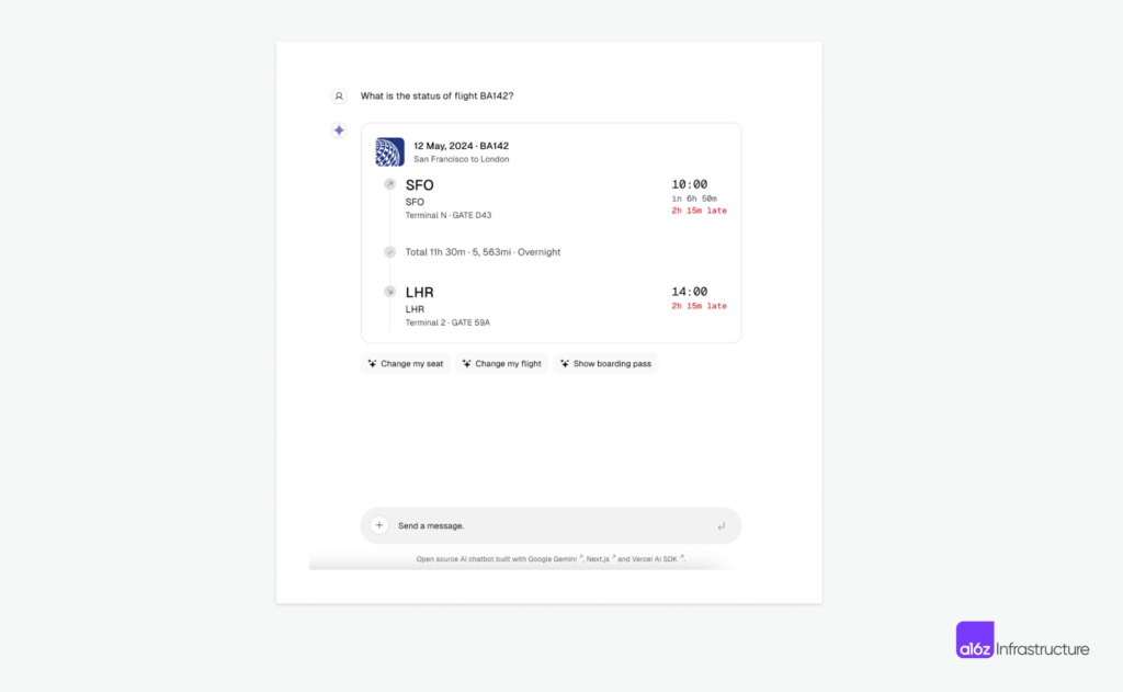
In Vercel’s AI SDK, for instance, the component surfaced in the chat is a choice made by the LLM on application state. If the user needs to change a flight, it will respond with the right component for selecting new flights.
Another example is Coframe’s implementation of dynamic-image and text-variant serving. The smallest atomic elements in a web app are texts and images, and LLMs and image models are great at creating variations for both. In this flow, an LLM determines when to serve a variant (either generated text or image) based on the live data it has access to, and as a result helps optimize website performance.
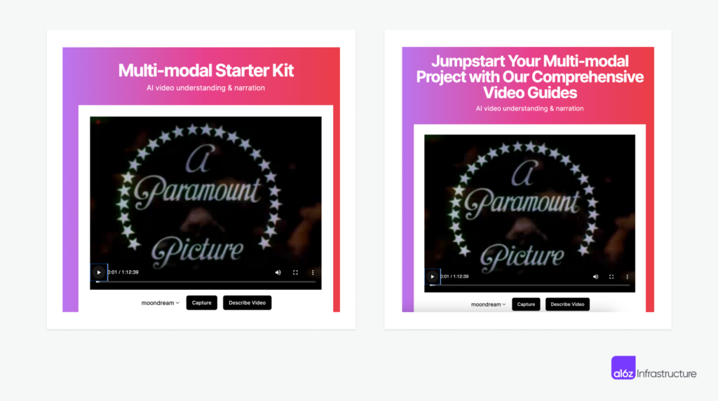
Using Coframe to dynamically update the tagline for the multi-modal starter kit.
Both examples above are the UI version of “function calling”: UI components are essentially functions, and are giving LLMs a visual state space to explore and reason about. This is the first step in formalizing what dynamic UI could look like in the near future and sets the stage for more customization on the component level later on: from the smallest unit of text/images, to fully adapting an interface based on user persona, state, device, and environment constraints.
Fully adaptive software interfaces
However, today’s dynamically served UI still requires hardcoded component state in order to ensure accuracy and aesthetics. Adaptive UI is on the other end of the spectrum, generating an interface that’s fully adapted to users’ needs.
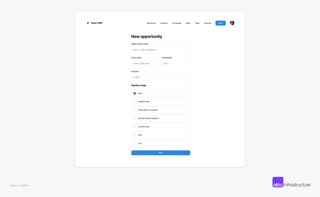
Anyone who’s touched Salesforce or Netsuite, for example, is familiar with the endless tabs and fields. And they’re crowding the screen more as the workflow becomes more complex. It’s not an exaggeration to say most enterprise software is a reflection of the underlying database schema, and each read and write requires its own screen asset.
In a world where the UI is adaptive to the user’s intention, interfaces could become just-in-time composition of components through a simple prompt, or inferred from prior actions, rather than navigating through nested menus and fields. An example like below, in a context aware CRM, where the user prompts “input an opportunity for a lead”, the UI could pre-select answers and redact unnecessary fields to make the workflow more streamlined.
The impact of such adaptive UI would be profound to all stages of a customer journey. For new users, it shortens the lengthy onboarding and training process, leading to instant aha moments and value recognition. For power users, it streamlines the multiple screens and dozens of clicks to complete a multi-step workflow. What’s even more interesting as a thought exercise is the impact to the browser automation industry: As the fixed bounding boxes go away, the workflow will need to be driven by the semantic meanings behind each component instead of simple DOM-level controls.
To take it a step further, for certain apps where the API and data model are fixed, the user interface can largely be inferred instead of designed. This is most common for internal applications, where most operations are CRUD into an existing database, and where the primary goals of the interface are to control and validate data types, as well as to control access. Existing no-code apps such as Airtable or Smartsheet are turning data tables into CRUD apps that have implemented this with a pure rule-based approach, but AI advances are certainly taking application development to the next level.
The road ahead
The application of generative UI in day-to-day software is still in its infancy stage. However, we have seen enough examples put out by Vercel, Galileo, Coframe, and others to know the future is near. What makes this wave of generative UI so exciting is not only the behavior change we have seen among engineers and designers, but also the technologies that enable these changes and create future possibilities:
- One capability that excites us the most is the advancement in multi-modal models: We now know that the models are capable of aligning what they see visually into languages (including code, which is a formal language), and this mirrors what human design engineers do. They have an idea of what to design in their brain, and then flesh out the detailed implementations using code. We believe that the models trained on multi-modal data will play a more central role in deciding from what to generate, how to edit, and to what to serve.
- While coding up AI-tamago, one interesting problem to solve was teaching an LLM to generate frames of ASCII animations — this led us to find research like Word-as-Images that explored the generation of words as image illustrations directly in vector format. In this case, they employed a text-to-image diffusion model (VLM) to offer visual feedback that may be overlooked by LLMs. This line of work could be applied to UI generation, too, given that one could find a balance point between well-scoped diffusion-based generation and a formal frontend programming language.
- Lastly, aesthetically pleasing code generation is one of the rare problems that naturally has tons of structured and high-quality data to pull from. There are great examples like Tailwind, Chakra UI, and other framework-specific, well-made templates on the internet, and the generated result could potentially provide the abstraction for the framework-specific code. The future could look like model-based generations with structured code underneath, much like today’s frontend frameworks abstract away the lower-level APIs.
There are many other things we have been thinking about, but we believe that the collective wisdom of the community can lead to even more great ideas. If you’re working on a product or tooling in this space, we’d love to hear from you!
Thanks to Abi Raja, Adrián Mato, Alasdair Monk, Behzod Sirjani, Cecilia Zhang, David Hoang, Derrick Harris, Jordan Signer, Josh Payne, Omar Abdul-Rahim, Shir Iluz, and Yael Vinker, who generously shared their insights and knowledge to inform this piece.
